
Help Center
Sections
Work with Sections - backgrounds and overlays, the Style presets, text color, max width, padding scales, height, and responsive visibility.
A Section is a full-width horizontal band of a page. Every page is a stack of Sections, and every Section contains Rows and Columns that hold the actual content. Sections are where you set the backdrop: background, color scheme, spacing, and width.
Creating a Section#
- On the canvas, click the add control between two existing Sections (or at the end of the page)
- Pick a Section Preset for a ready-made layout, or add a blank Section
- A new blank Section starts with one full-width Row and one empty Column, ready for elements
Content Tab: Background and Overlay#
Background Image#
Set Image to render a photo behind the whole Section - the classic hero band. The published site automatically serves a smaller image variant to phones and the full-size image to larger screens, so you do not need to prepare mobile versions yourself.
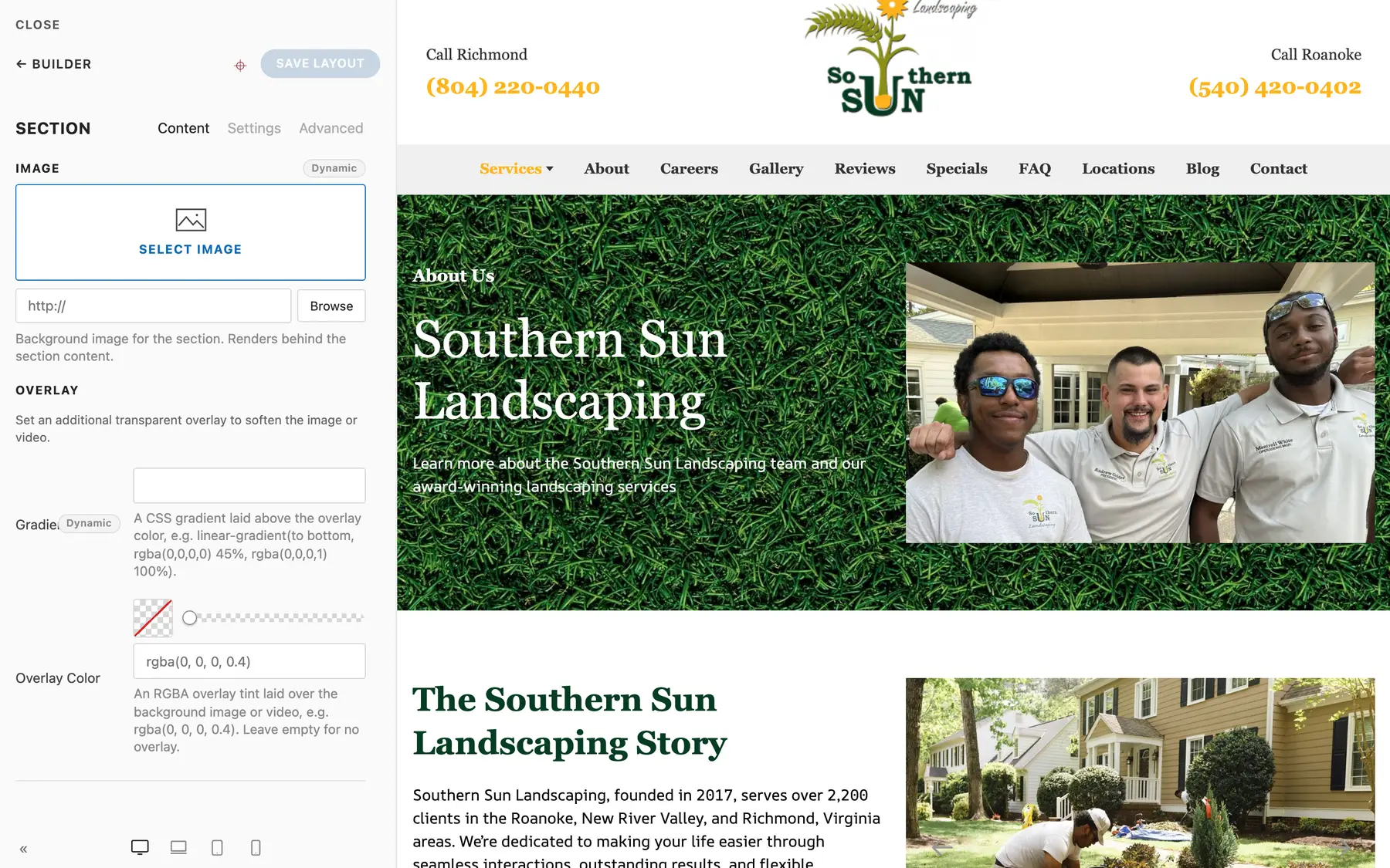
Overlay#
When text sits on a photo, use the Overlay group to keep it readable:
- Overlay Color - a transparent tint laid over the background, e.g. rgba(0, 0, 0, 0.4). Raise the alpha value for a darker, more legible backdrop.
- Gradient - a CSS gradient layered above the overlay color, e.g. a fade to dark at the bottom of a hero.
Leave both empty for no overlay at all.
Settings Tab#
Style#
The Style select applies one of the site's color schemes to the whole band:
| Style | Use for |
|---|---|
| Default | The normal page background |
| Muted | A subtle alternate band (great for zebra-striping sections) |
| Primary | A bold brand-colored band (CTAs, banners) |
| Secondary | The alternate strong scheme (often a dark band) |
Styles come from your site's brand colors in Site Settings, so they stay consistent across every page. With Style on Default you can also set a custom Background Color for a one-off band.
Text Color#
When a Section sits on a photo or a custom dark background, set Text Color to Light or Dark to force readable text, buttons, and controls across everything inside.
Max Width#
Max Width caps the content width inside the Section: Default, X-Small, Small, Large, X-Large, Expand, or None. The band itself always spans the full screen; this controls how wide the content column is within it.
Padding#
Vertical spacing uses two selects, Padding Top and Padding Bottom, each with a scale: Default, X-Small, Small, Medium, Large, X-Large, or None. Default is the standard section rhythm.
Padding is mobile-first by design: each step on the scale automatically renders tighter on phones and at full size on larger screens. That is deliberate - long desktop paddings feel empty on a phone. Do not fight it with custom CSS; pick the step that looks right on desktop and the phone version takes care of itself.
Height and Vertical Align#
- Height sets a minimum height: Small, Medium, Large, or Viewport Height. Viewport Height plus a background image is the full-screen hero pattern.
- Vertical Align (Top / Middle / Bottom) positions the content when the Section is taller than its content.
HTML Element#
Choose the semantic tag the Section renders as: section, div, aside, article, header, footer, or main. Leave it on section unless you have a structural reason.
Animation#
Optionally animate the Section as it scrolls into view: Fade In, Slide Up, Slide Down, Slide Left, Slide Right, or Zoom In, with an optional delay in milliseconds.
Show On (Responsive Visibility)#
Show on controls which devices render this Section:
- All devices (default)
- Desktop only - hidden on phones
- Mobile only - hidden on tablets and larger
Hidden Sections stay visible and editable in the builder; the hiding applies on the rendered site. This is how you build device-specific bands, like a sticky mobile call-to-action Section that desktop visitors never see.
Advanced Tab#
The standard Advanced bundle: Name (label it in the Outline - do this for every major Section), Status (disable without deleting), ID (anchor target for in-page links), Classes, Attributes, and scoped custom CSS. Prefer the native fields above before writing CSS - see Builder Basics.
Remember: Deploys Are Manual#
Editing and publishing a Section updates the CMS, not the live site. Your changes go live on the next manual Deploy. See Preview, Publish, and Deploy.
Summary#
| Control | Options |
|---|---|
| Style | Default / Muted / Primary / Secondary |
| Text Color | None / Light / Dark |
| Max Width | Default / X-Small / Small / Large / X-Large / Expand / None |
| Padding Top and Bottom | Default / X-Small / Small / Medium / Large / X-Large / None (auto-tightens on phones) |
| Height | None / Small / Medium / Large / Viewport Height |
| Show on | All devices / Desktop only / Mobile only |