
Help Center
Text Elements
Headings, rich text, lists, and dividers - semantic heading levels, sizes and colors, multi-column text, list styles, and alignment.
Four elements carry the written content of a page: Heading, Text, List, and Divider. They are simple on purpose - the styling comes from your brand settings, so the same elements look right on every site you build.
Heading#
A Heading is a single semantic heading line (h1 through h6).
Content#
Type the heading text in Content. A safe set of inline HTML is supported: use <br> to force a line break, or <strong>, <em>, and <span> for emphasis. Block tags and scripts are stripped at render, so pasted markup cannot break the page.
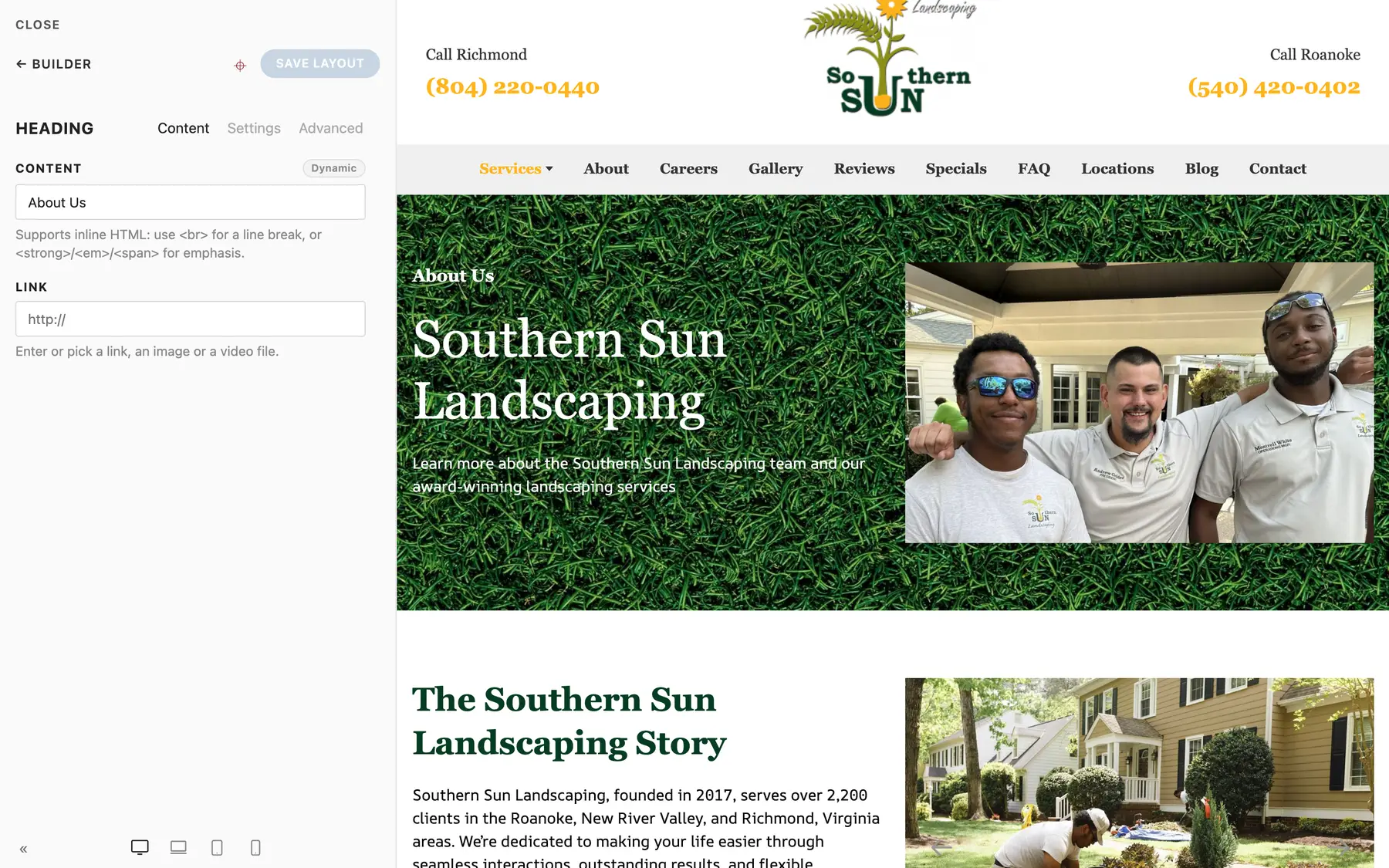
You can also set a Link to make the whole heading clickable.
Settings#
| Field | Options | Notes |
|---|---|---|
| Style | Default, Small, Medium, Large, X-Large, 2X-Large, Primary, Hero | The visual size. Display sizes override the tag's default size, so an h2 can render hero-sized. |
| Color | None, Muted, Emphasis, Primary, Secondary, Success, Warning, Danger, Background | Brand-token colors, not hex values. |
| HTML Element | h1 through h6, div | The semantic level. |
| Text Alignment | Left, Center, Right, Justify | |
| Max Width | Default, X-Small through X-Large | Caps the heading width as a percentage of its container to control line wrapping; the capped box follows Text Alignment. |
Headings also support the entrance Animation options, margins, and the responsive Show on control.
Heading Structure Matters#
Use exactly one h1 per page (usually the hero heading), then h2 for section headings and h3 below those. Style and semantics are separate controls here on purpose: pick the tag for document structure and the Style for how big it looks. Search engines read the tags; see Page SEO.
Text#
The Text element is a rich text block for paragraphs.
Content#
Edit the rich text in Content. Keep one idea per paragraph; the renderer preserves your paragraph breaks.
Settings#
| Field | Options |
|---|---|
| Columns | None, 2 through 6 - flows long text into newspaper-style columns |
| Drop Cap | Oversized first letter |
| Text Style | None, Meta, Lead, Small, Large, Badge |
| Text Color | None, Muted, Emphasis, Primary, Secondary, Success, Warning, Danger |
| HTML Element | div, p, address, blockquote |
| Text Alignment | Left, Center, Right, Justify |
Lead is the one to remember: it renders the paragraph slightly larger, made for the intro line under a hero heading.
List#
A List renders a styled list from individual List Item children. Add, reorder, and remove items in the Inspector.
Settings#
| Field | Options |
|---|---|
| Style | Default, Bullet, Divider, Striped, Hyphen, Circle, Square, Decimal |
| Size | Default, Large, Collapse |
| HTML Element | Unordered (ul) or Ordered (ol) |
Use a List for real list content (steps, inclusions, features as prose). For icon-and-text feature lists arranged in a grid, use the Grid element with icon position Left instead - see Grids.
Divider#
A Divider is a horizontal separator.
| Field | Options |
|---|---|
| Style | Default, Icon, Small, Vertical |
| HTML Element | hr or div |
| Alignment | Left, Center, Right |
Use Dividers sparingly - Section spacing usually separates content better than a rule does.
Alignment Consistency#
One habit that keeps pages looking professional: match alignment within a Section. A center-aligned Section should center its heading, its intro Text, and its buttons together - never a left-aligned heading floating above centered buttons. Vary alignment between Sections, keep it consistent inside each one.
Summary#
| Element | Use for |
|---|---|
| Heading | Every title, one h1 per page, h2/h3 below |
| Text | Paragraph copy, lead intros |
| List | Steps, inclusions, simple itemized content |
| Divider | Occasional visual separation |