
Help Center
Rows and Columns
Build responsive layouts with Row presets (Whole, Halves, Thirds, asymmetric splits) and per-breakpoint Column widths, order, and styling.
Rows and Columns are the layout grid inside every Section. A Row picks the column arrangement; each Column holds elements and can size itself independently at every screen width. Master these two and you can build any layout in the product without custom CSS.
Rows#
Choosing a Layout#
Every Row has a Layout preset. Pick it visually with the layout picker or from the select:
| Group | Presets |
|---|---|
| Equal | Whole, Halves, Thirds, Quarters, Fifths, Sixths |
| Two-column asymmetric | Thirds 2-1, Thirds 1-2, Quarters 3-1, Quarters 1-3, Fifths 2-3, Fifths 3-2, Fifths 1-4, Fifths 4-1, Sixths 1-5, Sixths 5-1 |
| Three-plus columns | Quarters 2-1-1, Quarters 1-1-2, Quarters 1-2-1, Fifths 3-1-1, Fifths 1-1-3, Fifths 1-3-1, Fifths 2-1-1-1, Fifths 1-1-1-2 |
| Fixed sidebars | Fixed-Left, Fixed-Right, Fixed-Inner, Fixed-Outer (one fixed-width column plus one that expands) |
The numbers describe the split: Thirds 2-1 is a two-column row where the first column takes two thirds and the second one third. Changing the preset reconciles the Columns automatically - existing content is kept and redistributed.
Edit Layout (Per-Breakpoint Widths)#
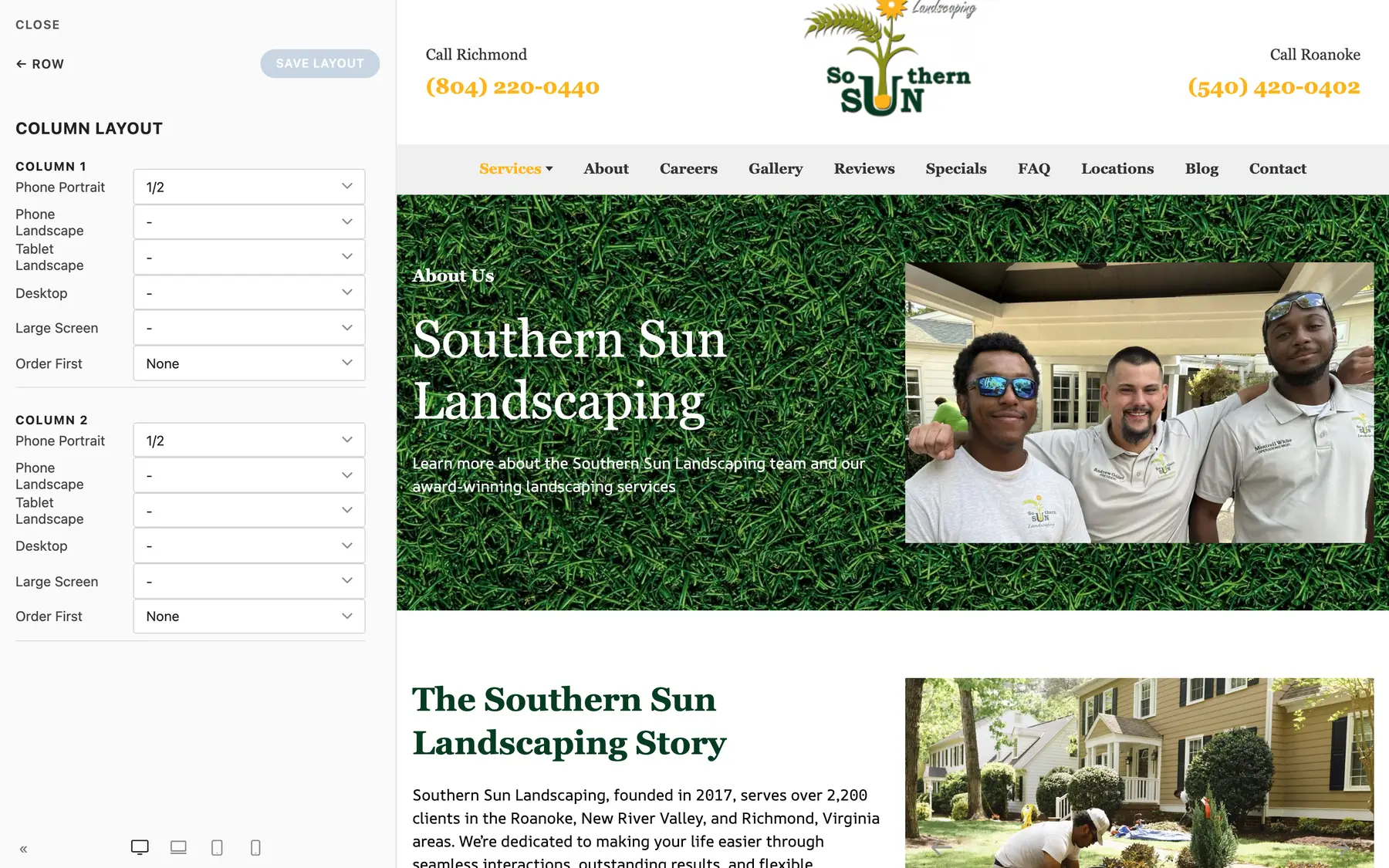
Click Edit Layout on a Row to open the column layout editor. It shows every Column with a width and an order control per breakpoint, from Phone Portrait up to Large Screen. This is the same data as the per-Column Width group described below, edited for all columns in one place.
Gaps#
- Column Gap - the horizontal space between columns: Default, Small, Medium, Large, or None
- Row Gap - the vertical space when columns wrap onto new lines (which happens on smaller screens): same scale
Never let side-by-side cards touch: keep a gap set on any Row that holds cards or tiles, and check both desktop (side by side) and phone (stacked) in the device preview.
Alignment and Max Width#
- Alignment - Justify (columns fill the row), Left, or Center (columns keep their size and the group aligns within the row)
- Max Width - cap the Row's width inside the Section: None, X-Small, Small, Default, Large, X-Large, Expand. Handy for narrowing a single Row (like an FAQ list) inside a full-width Section.
Margins, Overlay, HTML Element#
Rows also carry Margin Top / Margin Bottom scales, the same background Overlay group Sections have, and an HTML Element select (div by default).
Columns#
Select a Column to style the slot itself.
Width Group (Per-Breakpoint)#
Each Column has five independent width selects:
| Breakpoint | Field |
|---|---|
| Phone Portrait | Width |
| Phone Landscape | Width (Phone Landscape) |
| Tablet Landscape | Width (Tablet Landscape) |
| Desktop | Width (Desktop) |
| Large Screen | Width (Large Screen) |
Width values are fractions (1/1, 1/2, 1/3, 2/3, 1/4, 3/4, 1/5 through 4/5, 1/6, 5/6) plus Auto and Expand. An empty value inherits from the next smaller breakpoint, so the common pattern is: full width (1/1) on Phone Portrait, then the real split (say 1/2) from Tablet Landscape up. That is exactly what the Row presets set up for you - columns stack on phones and sit side by side on larger screens.
Order First#
Each breakpoint also has an Order First control (None / First / Last). Use it when stacking changes the story - for example, an image column that sits right of the text on desktop but should appear above the text on phones.
Vertical Alignment#
Align the Column's elements Top (default), Middle, or Bottom relative to the tallest column in the Row.
Background and Text Color#
- Image - a background image for just this Column
- Overlay - the same tint/gradient overlay group as Sections
- Background Color - a solid fill, which visually turns the Column into a panel
- Text Color - force Light or Dark text when the Column has its own dark background or image
Padding#
Padding sets the inner spacing on all sides: Default, Small, Medium, Large, or None. Combined with a background color, this is how you make a Column read as a card without writing any CSS.
Show On#
Like Sections, each Column has a Show on select: All devices, Desktop only, or Mobile only.
HTML Element and Advanced#
Columns can render as div, address, article, aside, footer, header, hgroup, nav, or section, and carry the standard Advanced bundle (Name, Status, ID, Classes, Attributes, scoped CSS).
Building Responsively: The Habit#
- Build the desktop layout with a Row preset
- Switch the canvas to the phone width
- Check the stacking order; fix with Order First where needed
- Check spacing; the Row Gap covers stacked columns
- Only then fine-tune individual breakpoint widths if the defaults are not right
You should almost never need custom CSS for layout. If a layout seems to demand it, look again at the presets, per-breakpoint widths, and gaps.
Summary#
| Task | Control |
|---|---|
| Two columns, 2/3 + 1/3 | Row Layout: Thirds 2-1 |
| Space between cards | Row Column Gap + Row Gap |
| Stack differently on phones | Column Width (per breakpoint) + Order First |
| Make a column a card | Column Background Color + Padding |
| Narrow one row of content | Row Max Width |
| Hide a column on phones | Column Show on: Desktop only |