
Help Center
Builder Basics
Learn the drag and drop website builder - the canvas, adding elements, the Inspector, the Outline, and how saving relates to going live.
Every page in Seedly Sites is built in the visual builder: a real drag and drop website builder with a live canvas, not a template picker. This page covers the parts of the builder you will touch on every page.
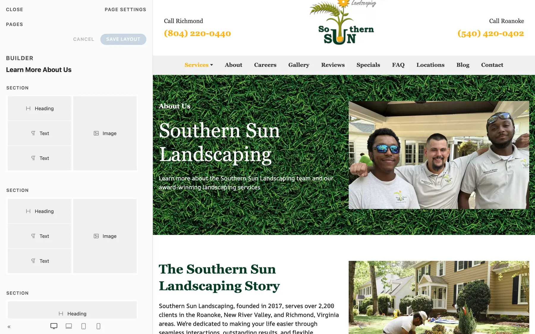
The Builder Layout#
Open any page for editing and you get three working surfaces:
| Surface | What it does |
|---|---|
| Canvas | A live preview of the page. Click anything to select it, drag to reorder, and see changes as you make them. |
| Outline | The page as a tree: Sections, Rows, Columns, and the elements inside them. Use it to select or move things that are hard to click on the canvas. |
| Inspector | The settings panel for whatever is selected. Fields are grouped into tabs, typically Content, Settings, and Advanced. |
The canvas also has a device-width switcher so you can preview the page at phone, tablet, and desktop widths while you edit.
The Page Structure#
Pages follow a strict hierarchy, top to bottom:
- Section - a full-width horizontal band of the page
- Row - a layout grid inside a Section (Whole, Halves, Thirds, and more)
- Column - a slot inside a Row
- Elements - the content itself: headings, text, images, buttons, grids, and so on
This structure is what keeps every page responsive. You never position anything with pixel coordinates; you place elements into columns and let the layout system handle each screen size. See Sections and Rows and Columns for the layout controls.
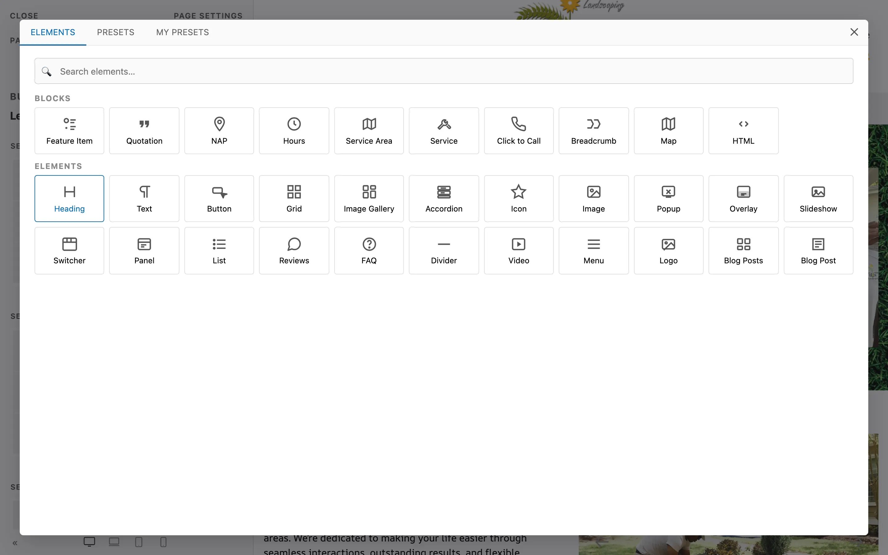
Adding Elements#
- Select the Column (or container element) you want to add to
- Click the add button to open the element library
- Pick an element tile - the library is organized with layout pieces first, then content elements and blocks
- The element appears on the canvas with placeholder content; select it and edit in the Inspector
The library also has a Presets tab (ready-made sections like heroes and feature grids) and a My Presets tab (sections you have saved yourself). See Presets and Saved Blocks.
Selecting and Reordering#
- Click an element on the canvas to select it and open its Inspector
- Drag elements on the canvas or in the Outline to reorder them
- Container elements (Buttons, Accordions, Grids, Slideshows) manage a list of child items; the Inspector shows the item list so you can add, reorder, and remove items
If you cannot grab something on the canvas, use the Outline - every node on the page is selectable there.
Undo and Redo#
The builder keeps a full edit history for your session:
- Cmd/Ctrl+Z - undo
- Cmd/Ctrl+Shift+Z (or Ctrl+Y) - redo
Standard text editing shortcuts keep working inside text fields.
Styling: Use Native Fields First#
Almost everything you want to change has a purpose-built field in the Inspector:
- Section Style, Text Color, Max Width, and padding scales
- Row Layout, gaps, and alignment
- Column widths per breakpoint, background, and padding
- Heading Style (size), Color, and Text Alignment
- Button Style and Size
Use those native fields. They keep the page consistent with the site's brand tokens, they respond correctly on every device, and they stay editable by anyone who opens the page later.
The Advanced Tab#
Every element carries the same Advanced bundle:
| Field | Purpose |
|---|---|
| Name | A label for this element inside the builder (shows in the Outline) |
| Status | Disable the element so it stays in the page but does not render on the live site |
| ID | A custom HTML id (useful for anchor links) |
| Classes | One or more CSS class names, separated by spaces |
| Attributes | Extra HTML attributes, one per line as name=value |
| CSS | Custom CSS scoped to this element only |
The CSS box is the escape hatch, not the default. Reach for it only when no native field models what you need. If you find yourself writing CSS for padding, colors, alignment, or widths, there is almost always a native field that does it better.
The Classes field is how you apply your site's shared brand classes so one global change updates every element that uses them - see Brand DNA.
Saving, Publishing, and Going Live#
This is the most important concept in the whole product:
- Save stores your work in the CMS
- Publish marks the page as the version that should be live
- Deploy actually rebuilds the static site and ships it to hosting
Publishing does not change the live website. Nothing changes the live website until someone clicks Deploy. Deploys are always a deliberate, manual step - there is no automatic deploy when you save or publish. This is a safety feature: you can edit and publish all afternoon, then ship everything in one reviewed deploy.
Read Preview, Publish, and Deploy for the full workflow.
Summary#
| Task | Where |
|---|---|
| Add an element | Select a Column, click add, pick from the library |
| Change content | Select the element, use the Content tab |
| Change styling | Select the element, use the Settings tab (native fields first) |
| Anchor links, classes, custom CSS | Advanced tab |
| Reorder anything | Drag on the canvas or in the Outline |
| Undo a mistake | Cmd/Ctrl+Z |
| Make it live | Save, publish, then Deploy (manual, always) |